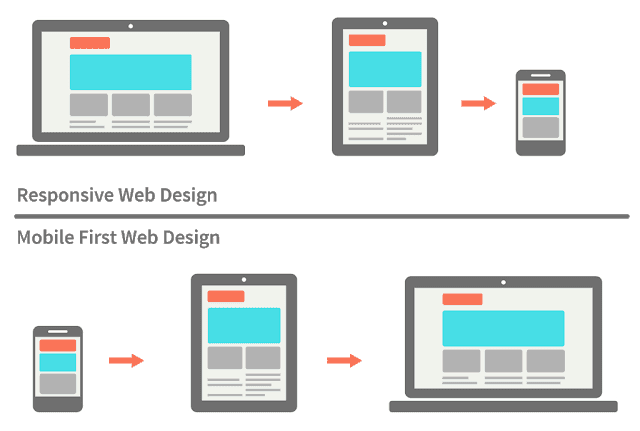
Thiết kế website để bảo mật, chạy mượt mà, giao diện đẹp và đặc biệt tương thích với mọi thiết bị di đông luôn là những yếu tố cơ bản để khách hàng hàng lòng.
Nếu bạn làm website hoặc một ứng dụng mà không cần sử dụng tới các tool hoặc framework hỗ trợ reponsive như bootstrap… bạn có thể tự code css cho tất cả các màn hình di động.
Dưới bài viết mình note lại một số kích thước phổ biến cho các loại màn hình thiết bị di động. Bạn có thể copy sử dụng cho dự án của mình.
Danh sách kích thước các màn hình
Thống kê các kích thước màn hình cơ bản phục vụ cho thiết kế Web Responsive.
Tham khảo:
- max-width: 320px (điện thoại di động, hiển thị chiều dọc)
- max-width: 480px (điện thoại di động, hiển thị chiều ngang)
- max-width: 600px (máy tính bảng, hiển thị chiều dọc)
- max-width: 800px (máy tính bảng, hiển thị chiều ngang)
- max-width: 768px (máy tính bảng loại to, hiển thị chiều dọc)
- max-width: 1024px (máy tính bảng loại to, hiển thị chiều ngang)
- min-width: 1025px (từ size này trở lên là danh cho desktop thông thường).
Cách viết CSS cho các kích thước màn hình
/* Màn hình máy tính bảng nằm ngang */
@media all and (max width: 800px) {
...
}
Hoặc
/* màn hình abc */
@media only screen and (min-width: 960px) and (max-width: 1024px) {
...
}
Code CSS cho các màn hình
/* Smartphones (portrait and landscape) ----------- */
@media only screen and (min-device-width : 320px) and (max-device-width : 480px) {
/* Styles */
}
/* Smartphones (landscape) ----------- */
@media only screen and (min-width : 321px) {
/* Styles */
}
/* Smartphones (portrait) ----------- */
@media only screen and (max-width : 320px) {
/* Styles */
}
/* iPads (portrait and landscape) ----------- */
@media only screen and (min-device-width : 768px) and (max-device-width : 1024px) {
/* Styles */
}
/* iPads (landscape) ----------- */
@media only screen and (min-device-width : 768px) and (max-device-width : 1024px) and (orientation : landscape) {
/* Styles */
}
/* iPads (portrait) ----------- */
@media only screen and (min-device-width : 768px) and (max-device-width : 1024px) and (orientation : portrait) {
/* Styles */
}
/**********
iPad 3
**********/
@media only screen and (min-device-width : 768px) and (max-device-width : 1024px) and (orientation : landscape) and (-webkit-min-device-pixel-ratio : 2) {
/* Styles */
}
@media only screen and (min-device-width : 768px) and (max-device-width : 1024px) and (orientation : portrait) and (-webkit-min-device-pixel-ratio : 2) {
/* Styles */
}
/* Desktops and laptops ----------- */
@media only screen  and (min-width : 1224px) {
/* Styles */
}
/* Large screens ----------- */
@media only screen  and (min-width : 1824px) {
/* Styles */
}
/* iPhone 4 ----------- */
@media only screen and (min-device-width : 320px) and (max-device-width : 480px) and (orientation : landscape) and (-webkit-min-device-pixel-ratio : 2) {
/* Styles */
}
@media only screen and (min-device-width : 320px) and (max-device-width : 480px) and (orientation : portrait) and (-webkit-min-device-pixel-ratio : 2) {
/* Styles */
}
/* iPhone 5 ----------- */
@media only screen and (min-device-width: 320px) and (max-device-height: 568px) and (orientation : landscape) and (-webkit-device-pixel-ratio: 2){
/* Styles */
}
@media only screen and (min-device-width: 320px) and (max-device-height: 568px) and (orientation : portrait) and (-webkit-device-pixel-ratio: 2){
/* Styles */
}
/* iPhone 6 ----------- */
@media only screen and (min-device-width: 375px) and (max-device-height: 667px) and (orientation : landscape) and (-webkit-device-pixel-ratio: 2){
/* Styles */
}
@media only screen and (min-device-width: 375px) and (max-device-height: 667px) and (orientation : portrait) and (-webkit-device-pixel-ratio: 2){
/* Styles */
}
/* iPhone 6+ ----------- */
@media only screen and (min-device-width: 414px) and (max-device-height: 736px) and (orientation : landscape) and (-webkit-device-pixel-ratio: 2){
/* Styles */
}
@media only screen and (min-device-width: 414px) and (max-device-height: 736px) and (orientation : portrait) and (-webkit-device-pixel-ratio: 2){
/* Styles */
}
/* Samsung Galaxy S3 ----------- */
@media only screen and (min-device-width: 320px) and (max-device-height: 640px) and (orientation : landscape) and (-webkit-device-pixel-ratio: 2){
/* Styles */
}
@media only screen and (min-device-width: 320px) and (max-device-height: 640px) and (orientation : portrait) and (-webkit-device-pixel-ratio: 2){
/* Styles */
}
/* Samsung Galaxy S4 ----------- */
@media only screen and (min-device-width: 320px) and (max-device-height: 640px) and (orientation : landscape) and (-webkit-device-pixel-ratio: 3){
/* Styles */
}
@media only screen and (min-device-width: 320px) and (max-device-height: 640px) and (orientation : portrait) and (-webkit-device-pixel-ratio: 3){
/* Styles */
}
/* Samsung Galaxy S5 ----------- */
@media only screen and (min-device-width: 360px) and (max-device-height: 640px) and (orientation : landscape) and (-webkit-device-pixel-ratio: 3){
/* Styles */
}
@media only screen and (min-device-width: 360px) and (max-device-height: 640px) and (orientation : portrait) and (-webkit-device-pixel-ratio: 3){
/* Styles */
}
Nếu bạn quan tâm nhiều về thiết kế font-end có thể tìm hiểu sâu hơn về UI và UX cải thiện hơn về giao diện, biết thêm về thói quen người dùng sử dụng thiết kế sản phẩm sao cho thân thiện nhất nhé!
Hãy tham gia vào cộng đồng ICTsharing trên facebook để giao lưu và trao đổi kỹ hơn nhé!